|
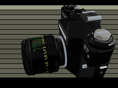
Zenit by Nesnausk! [web]
[nfo]
|
||||||||||||||
|---|---|---|---|---|---|---|---|---|---|---|---|---|---|---|

|
|
|||||||||||||
|
popularity : 68% |
|||||||||||||
alltime top: #1420 |
|
|||||||||||||
|
||||||||||||||
| added on the 2007-04-08 17:08:53 by magic |
||||||||||||||
popularity helper
comments
boring
added on the 2007-04-08 17:15:58 by stOPHER2 
its good, but gets a little boring.
What elz says. Still thumb.
Had to press esc with this one. Nice idea, but it makes you to sleepy when watching.
i actually *loved* this! yeah, it's longwinded, but also really well made so it's worth it.
Boring, but impressive!
nice! liked the overall performance.
Mad props for the effort.
I owned this p.o.s., it used to rip the perforation of modern film to shreds... 8)
its kool! should have been made a bit shorter for the big screen presentation tho.
i second mSW
this lasted way longer than I could enjoy. but perhabs it only works if you are into cams.
Nice presentation of the Zenit camera :) You guys really know the camera well. It lasted a bit too long, though..
Wicked! Everything is so detailed. The concept is great.
a bit long, but cool idea and well made
Thumbs for the effort. I've actually seen how a disassembled camera looks like - it's scary! The demo is a one-man show as well (except music), so that's doubly impressive.
It does get a bit boring in the disassembling parts though; more parts with girl-in-the-manual or focus-blur-cup would be welcome.
It does get a bit boring in the disassembling parts though; more parts with girl-in-the-manual or focus-blur-cup would be welcome.
Add some lighting/texturing, remove a minute or so (the middle section is quite boring) and this is a winnahdemo. Creative concept!
INCREDIBLE!
the ultimate CAD nerd's dream :D
the ultimate CAD nerd's dream :D
Very nice concept, and cool presentation. Could have done with a bit more variation, or perhaps just a shorter run. I do love that the demo keeps itself strictly within the concept tho, too few demos do that.
More brightness would have done you a favor as well.
More brightness would have done you a favor as well.
music was a bit repetitive and demo was a bit long, but seriously, this is cool shit! :D
Fantastic work.
Thumbs up for the effort.
zenit rlz \o/ mouse events part rlz \o/
this is completly nuts.
too long. but: whoa!
Insane amount of precise modelling and animation, plus interactive part... Cool! :)
woot!
very cool! i like it! nice job
OMFG INCREDIBLE!
Really cool idea and nicely done. A little bit long though.
ok uh, is the top-left quarter of the picture being visible and everything else cut off intentional? :o
I guess not... what's the hardware?
Insane work, but yeah, gets really boring. Some proper lighting or postfx would've made it a bit more enjoyable cause now it looks really pale.
insane work
gets boring
i want the same with paris hilton
gets boring
i want the same with paris hilton
nearaz: x1600 mobility + core2 duo t2400
lol guardian but there's already almost nothing to strip off paris hilton... or do you want to see her very own internal stomach ? o_O
zest > thus shorter while being more attractive :D
and since two real models need to be sacrificed, i can only think of the hilton sisters
and since two real models need to be sacrificed, i can only think of the hilton sisters
Completely insane and FAT o_o
Congratulations...
.
Congratulations...
.
Just a note: maybe a little starting GUI to choose even higher screen (and maybe textures?...) resolutions would be good to better appreciate the complexity of the model.
I've also noticed the same bug Gargaj mentioned.
Always ati, mobility Radeon 9700.
I've also noticed the same bug Gargaj mentioned.
Always ati, mobility Radeon 9700.
Really nice and sweet demo, a bit boring, but kinda cool design wise, and i love that interactive thingie at the end :) Nesnausk <3
damn cool concept, and close to perfect execution!
Maybe technically advanced but fucking boring to watch.
When I saw the screenshot I immediately think of that : http://www.pouet.net/prod.php?which=3340
Then I realize my mistake. What a huge amount of work. On one hand, Thumb Up!.. you really deserve it. But, in otherhand, I regret that typically sense of derision you had in "Syntonic Dentiforms", or even you're cartoonistic experience like "The Fly". It lacks a little bit of fun. Where is you're demo touch. Anyway big up for your amazing job!
Then I realize my mistake. What a huge amount of work. On one hand, Thumb Up!.. you really deserve it. But, in otherhand, I regret that typically sense of derision you had in "Syntonic Dentiforms", or even you're cartoonistic experience like "The Fly". It lacks a little bit of fun. Where is you're demo touch. Anyway big up for your amazing job!
i pressed escape after a while too, as disassembling the camera took too long :P what a bore, piggy cos it did look ok
what gargaj said on core duo+radeon mobility x1400 laptop.
and even with that, the concept is so fucking cool.
i just can't understand people saying that this one is boring/long.
and even with that, the concept is so fucking cool.
i just can't understand people saying that this one is boring/long.
Nice theme :) My dad has a Nikon, he'll love this demo... I can't imagine the amount of work and the time it took you guys to model the camera... Interactive mode is ok too :) Rulez.
FUCKING HUGE WORK!
nngh.. I got tired just thinking about the work involved in making this demo.. crazy!
The rendering is a little bit pale though, but somehow realistic in the gl-lighting sense. Needs more contrast and maybe some more lights to make stuff more dynamic?
Timing motions to every basedrum hit without much "initiative" is usually not so hot in my book. Every other group seems to love it though. Better to do something a bit more subtle to something that is as regular as the 4/4 beat. (like the eyes in lucy in the sky with deities)..
I see a lot of cameras pictured in white rooms for commercials. Maybe a white bakground would be the shit. with some projected and blurred shadows on a plane beneath or behind the camera or something for some extra effect... Dunno. Just got to repeat that the work done on the camera model is awesome!!
Crashes here, what HW does it need?
Very weird idea... The 3d model is very nice and complex, but the rendering is kinda ugly. And the constant cutting and flashing bothered too. But worthy a thumb anyways.
wow. impressive! this is madness!
madness? this is ZEENIITAAAAAAA!
WOW! This is really impressive. Respect for extremely detailed camera model and decomposing animation. I'm really impressed by the amount of work put into this demo. This is just great.
P.S. Next time please oh please use multisampling!
P.S. Next time please oh please use multisampling!
hardware pr0n! Excellent!
impressive. *massive* amount of work here.
you guys are fucked up!
Wicked
bugfix plz >:S
also waiting for final
I also have only one quarter of the 3d layer (Radeon x1950, latest drivers, everything else works fine). However in interactive mode it works perfectly....
Indeed, what a big amount of work. I would enjoy a fixed version, with higher resolution and/or antialiasing, and _please_ a "flash mode off" button on startup :)
I wait to the final/fixed, for the thumb up.
Indeed, what a big amount of work. I would enjoy a fixed version, with higher resolution and/or antialiasing, and _please_ a "flash mode off" button on startup :)
I wait to the final/fixed, for the thumb up.
Great work with all the objects.
My god, what a lot of work!
Holy Crap! That is a hell of a lot of modeling work right there. That gets them a thumbs up.
Nice
Un-be-lie-va-ble!
AWSOME! you should sell "this" to a camera manuf.
Like the music also!
Like the music also!
The whole presentation & music was just too boring. Piggy for the effort.
i had a zenit too
obsessed maniacs!!! awaiting for zorka & smena sequels... :>
Great but to long :<
Quite neat idea and execution. Reminds me of an engineering graphics course I took a while back :-)
Damn great idea, concept and realization.
Reverse engineering taken literally! =D
Reverse engineering taken literally! =D
As being a photographer, I particularly enjyed this one. Great idea, impressive work, nice design & music.
:O
Really cool! Especially the last part where you can reassemble the camera.
strange concept, but kewl :)
to long. boring. blaaa.
but still like porn in some way
but still like porn in some way
te ma takego! :)
Could use more pixels. Regardless, I'm sure Zenit would be pleased.
coool veryyy muuuch
It's so huge work...
It's so huge work...
HD version can has?
No thumb!?
Awesome modeling work! And the interactive part is a big plus!
Awesome modeling work! And the interactive part is a big plus!
obsessed maniacs!!!²
CADemo :)
Only idiots can say that it is boring, because they are themselves really boring.
awesome.
You used a Helios 44-2 lens but didn't replicate it's bokeh, makes me sad :-)


Ah I remember seeing this at demoscene.tv on the stream, and thinking to myself how fucking crazy those sceners must be to model all this.
Holy shit for the effort and execution! <3
Holy shit for the effort and execution! <3
submit changes
if this prod is a fake, some info is false or the download link is broken,
do not post about it in the comments, it will get lost.
instead, click here !
