|
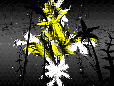
corrosive gas by CLRSRC [web]
[nfo]
|
||||||||||||||
|---|---|---|---|---|---|---|---|---|---|---|---|---|---|---|

|
|
|||||||||||||
|
popularity : 59% |
|||||||||||||
alltime top: #7959 |
|
|||||||||||||
| added on the 2006-10-11 06:52:45 by raist |
||||||||||||||
popularity helper
comments
looking good, sounding not so good.
i second bhead...
simple filtering, but nice result!
quite nice, audio indeed could use some extra element to it
nope, that one kinda sucked... not my style
was incredibly slow on my computer so i'll withhold my thumb for now
what ps and bhead said
short and sweet, sortof messy in a good way, i quite liked the visuals, but whats up with music there was a filter over the whole thing sounded really bad.
Rather MTV, but nevertheless quite captivating.
The first couple seconds impressed me-- a nice launcher which included the loader bar as a surprise, and the first view to come up was unusual and pretty cool. I felt it was kind of dull after that, and it looped at the end by default (?).
Like some of the others, I think better audio would have brought it up a lot.
like it. :) the mp3 sounds like it has been encoded with a xing-encoder from 1997 though.
correction: the mp3-file sounds just fine when played back on it's own, it's the replayer in the demo that's fucked. raist - check your code and this demo goes up two notches. :)
eh.. ok, so now i see that the credits lists raist with "musicmix" so perhaps it's intentional anyways.
gloom & others: yes, .mp3 in .zip file isn't played in demo, it is original version. In demo is my distorded , modulatedm slowed,... version, because of i like it's atmosphere. But yes, im still suck in final sound mix.
thanks all for comments :)
thanks all for comments :)
quite original. one of the best demos lately.
Nice gfx, bad soundtrack.
pretty cool rendering.. And sticks to it's style :)
k
I was expecting some killer effects after first seconds of this prod, but it turned into "just" good synced sequences of 3d objects.
It could stop and exit at the end rather than loop, because it gives impression of watching a scene-player a bit. Umm.. "WOID & MOPPI PRODUCTIONS - tools", yeah, that explains why ;). Thumb up anyway!
It could stop and exit at the end rather than loop, because it gives impression of watching a scene-player a bit. Umm.. "WOID & MOPPI PRODUCTIONS - tools", yeah, that explains why ;). Thumb up anyway!
This is ok, but it doesn't offer anything impressive.
short and effective.
Looked great at the beginning but got boring pretty quickly. Bad and boring music as well.
+ liked the style
- didn't like the crash and seg fault BSOD at the end
- didn't like the crash and seg fault BSOD at the end
very cool ... love the rendering ... the music is a bit so-so, though !
nice use of shaders, overally very stylish. soundtrack fits. could become classic if there only was more content.
Quote:
could become classic if there only was more content.
Endpart is very nice. But too short.
very polished
neat design
love the colors & design.
really good, nice visuals and shading and I like the moosik as well. On top of that, it ran fluently even on a piece of shit gma x3100
High quality of Raist's design ;o)
I miss any Brno party a lot.
I miss any Brno party a lot.
submit changes
if this prod is a fake, some info is false or the download link is broken,
do not post about it in the comments, it will get lost.
instead, click here !

thumb for not looking like everything else seen before.