|
tAAt 2006 by tAAt [web]
[nfo]
|
||||||||
|---|---|---|---|---|---|---|---|---|

|
|
|||||||
|
popularity : 56% |
|||||||
alltime top: #14049 |
|
|||||||
| added on the 2006-01-01 00:46:16 by tarzan |
||||||||
popularity helper
comments
oh well :)
sucks added on the 2006-01-01 01:04:40 by waffle 
maybe i was being too harsh but anyway it's somewhere in between a piggie and a thumb down so there you go
cool effect though 1.5mb is more than enough for this.
ROXXXXXXXXXXXXXXX
hmm, technically.. well, nice, but not excellenot nor good but ok.
music was better than ps/(calodox ?) can do.
colors where not as good as DXM wouldve put out.
hmm, well, wtf.. ok!
music was better than ps/(calodox ?) can do.
colors where not as good as DXM wouldve put out.
hmm, well, wtf.. ok!
Coolos ;)
2006!!!!!!!!!!!!!!!!!!!!!!!!!!!!!!!!!!!!
in stlye!
in stlye!
Not really..
yay, taat
Very bad and very pointless.
sick
The effect is f*cking cool.
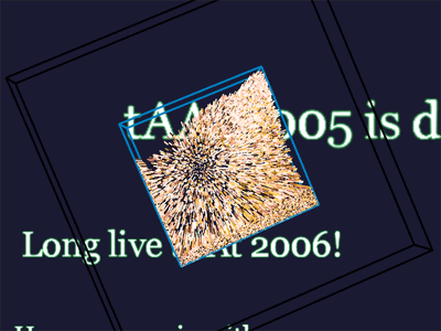
I liked the effect, very original. But it's a little bit empty for its size. This could be a great 4kb intro or a part of 64kb intro. If size is over a MB, then it should have a design :) Thumb up for the original gravity effect.
its ok for a first prod
nice effect, even if it has been great to use some different colors which "stay grouped" like in these "sable in glasse" things...
taat.
Great!
Always nice to see some physique effects. The colors were not the best but nevertheless the worse. However, the effect could have been used differently. Reminds me about some Horizon demo on the Amiga 500 :D But I doubt they used realtime physique. More of this stuff and things are starting to take place for 2006!
the effect seemed like a cool idea but in generally it seemed a bit poorly executed...
joo
It would be a great game to rotate the cube with mouse until the original logo is reassembled :)
hmmm
ugly, pretty unrealistic physics too :/
Haha! taat-style 2006... :-D
Nice effect though!
Could have been a very nice demopart in a more complex release with more design and quality-effort (improved physics engine etc...)
Sad you made only a one-part release with way too less text as well... ;-)
But nice to see something from taat again either way! Hope there will be MORE this time in 2006 compared to 2005-releases! ;-)
Go for it, guys! :-)
Haha! taat-style 2006... :-D
Nice effect though!
Could have been a very nice demopart in a more complex release with more design and quality-effort (improved physics engine etc...)
Sad you made only a one-part release with way too less text as well... ;-)
But nice to see something from taat again either way! Hope there will be MORE this time in 2006 compared to 2005-releases! ;-)
Go for it, guys! :-)
...and next time the music could have also been placed in a ~120kb .MOD instead of a ~1.1MB ogg-file, too! ;-D
I stared at the box for ten minutes.
like Lionhead Studios ;-)
great!
great!
Impressive code wise, but not much more to say...
just for the music...
I really liked that effect!
ok one
submit changes
if this prod is a fake, some info is false or the download link is broken,
do not post about it in the comments, it will get lost.
instead, click here !
