|
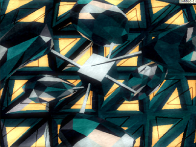
Sound Pressure by xplsv [web]
[nfo]
|
||||||||||||||
|---|---|---|---|---|---|---|---|---|---|---|---|---|---|---|

|
|
|||||||||||||
|
popularity : 67% |
|||||||||||||
alltime top: #1470 |
|
|||||||||||||
| added on the 2005-07-25 11:20:49 by mrdoob |
||||||||||||||
popularity helper
comments
Killer Piece of Work
rulez added on the 2005-07-25 11:35:42 by Mike 3D 
Hmmm ... maybe a little too stylish for me ... ^^
Only become interesting from the greetings part, and the edge detection filter ...
Only become interesting from the greetings part, and the edge detection filter ...
okay... please, MAKE SHORTER DEMOS.
there are very nice visuals, but yeah... for my taste it's too often almost the same. still rulez.
there are very nice visuals, but yeah... for my taste it's too often almost the same. still rulez.
The beginning was so boring that I almost pressed escape.. but I'm glad I ddn't, because it evolved into a killer demo. Ion Traxx meets Variform. Pounding and hypnotic. One of my favourites from 2005 so far..
this was nice.. but why is this stuff so slow sometimes (even on a fx)???!
Music is definitely not my taste, but visuals are great, and they fit the music perfectly well. Rulez.
What Preacher said...
It's nice, but it's also longgggggg. But it's enjoyable
Nice, really good flow all the way through, good design, and some really nice effects. Credits part was great, so was the edge detection. Keep 'em coming!
heh, i want a summary :)
very cool.
great visual.
good music.
and fitness scene.
great visual.
good music.
and fitness scene.
about kohai's comment, WHY shorter demos? If you have ideas to show, they must be in your piece of art. Even a 16 sec demo can be boring. This one's not. This demo rulez. It won the Euskal05 demo compo so it doesn't seem to be so long...
Loooooooooooooooooooooong. Better to watch it while dancing, not resting still on a chair.
Nice music and fxs, I liked that jaggy-polyrender.
(the fonts remembered me these one)
Nice music and fxs, I liked that jaggy-polyrender.
(the fonts remembered me these one)
The problem is not that the demo is too long - the problem is that each effect is shown too long. So it becomes boring (even the slow music supports that) - time to sleep... zzz
Really impressive. Really don't know how you get ideas to make so strange effects :-) I like that, this is not a 3ds-max movie player as almost every demo today. Really cool !
simply stylish... i like everything about that one, espexially the fresh ideas
AUPA SHINEEEEEEEEE!!!!!
he's worth winning this prize... long months of hard work are shown in this demo! \o/ \o/ \o/
he's worth winning this prize... long months of hard work are shown in this demo! \o/ \o/ \o/
This was damn NICE! A killer demo!
excellent stuff! could go on forever if you ask me. only for the music.
Maybe some of the objects/effects were okay to look at, but this thing dragged on and on. I looked at the mp3 file and was surprised the music was only seven and a half minutes long -- it seemed more like an eternity.
But, I should also point out that the part featuring the photo of a lake with overlayed spinning 3D object held promise. If only the reeds/grasses/whatever had been edited to have visual priority over the object, thereby "immersing" the computer generated 3D into the real life 2D photo.
hypnoglow!
In my opinion, too long and out of context...
For VJ session in a pub this fits vastly, but actually not the thing to enjoy in the way we used to enjoy demos...
In the other hand I admire and aplause the great effect repertory mastered by shine cool!!! cheers! ...but next time,try to aim your weapon to another plot or idea behind the demo.
For VJ session in a pub this fits vastly, but actually not the thing to enjoy in the way we used to enjoy demos...
In the other hand I admire and aplause the great effect repertory mastered by shine cool!!! cheers! ...but next time,try to aim your weapon to another plot or idea behind the demo.
progressive.
the sync is accurate but feels random at times. also one could have synced smaller animated structures insted of full-screen objects/structures from time to time. it would have made the demo more polished but also less massive...
respect and keep it up.
the sync is accurate but feels random at times. also one could have synced smaller animated structures insted of full-screen objects/structures from time to time. it would have made the demo more polished but also less massive...
respect and keep it up.
thumb up for boringfunnytransitions
i'm not sure i'm watching this demo as it should be (P42.8 GF FX5700 here)... it's nice at some parts, but the used buffers are too low-res and the speed is ultra-slow (most of the time the motion is pretty jerky, which won't give you any speed-synch effect).
Looks promising if it's as I "imagine", and taking your comments, it seems it'll be cool... but I'll save my thumb till I watch it 100% correctly I guess.
Looks promising if it's as I "imagine", and taking your comments, it seems it'll be cool... but I'll save my thumb till I watch it 100% correctly I guess.
Good VJset. Cool synch, cool effects and also interesting music. You've made a good work :)
Cool music and good synch. Nice work shine!
I´d consider making the buffers the same size of the back buffer though, you can see some artifacts here and there.
Although it feels a bit too long for a demo, I watched the whole thing without getting bored at all, but maybe adding a "jump to next scene" key would be a good idea.
Of course, that would be completely useless unless people actually read the .nfo file first :-p
thumb me beautiful!
Cool vj show, I wish i could see some stunning visuals too, next time. I like it anyway.
nice!
Really interesting!!
+ nice colorsheme
+ cool flow
+ moody superb soundtrack
+ not much flashing overall
- beginning is boring
+cool comic rendering
i love you guys
+ cool flow
+ moody superb soundtrack
+ not much flashing overall
- beginning is boring
+cool comic rendering
i love you guys
ah, ad the greenings part is the killer!
Shine, we had the same problem with the RTT with die anderung (too pixelated borders). Try making the buffer larger than the final rendering on the screen to avoid it
I could only watch the strange cartoon effect (i think it was done with some kind of fragment shader) at the party but was really nice :) For this and the realtime bevel effect, among others, thumb up! =)
I could only watch the strange cartoon effect (i think it was done with some kind of fragment shader) at the party but was really nice :) For this and the realtime bevel effect, among others, thumb up! =)
Now that's a kinky way to render things... almost hypnotic. Kääk
Great! Good composition work, and also some nice effects -especially the greetings part-.
Hope to see the VJ in live action soon :)
Hope to see the VJ in live action soon :)
This was great at the party, with none of the abovementioned artifacts. Good rendering style!
Not bad. Long though.
I love it. Hypnotic sync, music & visuals. Sufficiently lengthy to allow you to enjoy the atmosphere... Great.
Nice work.
ust croot!
yep
maybe was better to watch it in the bigscreen at the party... now in my computer, i think that is a bit boring and longer... but i still liking.. good work shine!
I really like this.
<3
uninteresting. it isn't that the music or effects are poorly done - they just don't go anywhere. I'm not seeing any minimalism vibe... just an unfocused demo.
Not impressive. Boring, slow, all seen here and there a thousand times. Music is nicely relaxing though.
it's been a while that I am secretly praying for demos made on dub tracks. Too bad this demo does not really play well with its soundtrack. I think it does not quite know how to interact with it here.. almost like the demo thought the soundtrack was more bouncy and hard edged that it really is.
I liked it :)
very nice
Lengthy and bland at times, but still pretty cool nonetheless.
thumb for the dub :) . visuals pretty much reflect their vj roots.
VERY GOOD PRODUCTION !
trippy *_*
zZZ/ohh!
nice, very nice, specially the music. I would like it to be longer thou
Great! :)
Nice VJing, atmospheric sountrack. A bit too long, but still rulez.
for me, it's boring and with bad colors, but it still ok, of course ;))
good visuals and a relaxed dub house tune. But those two do not normally mix.
Thus, it is awfully boring and long :/
Thus, it is awfully boring and long :/
a bit too long for my taste, other than these it's cute as in visuals.
Chillout enhancer!
Rather beautiful visuals and I feel almost bad saying that this one is wrecked by the music - because actually the music is quite nice. It's just not demo music, in my opinion. Demo music should change throughout the production - it should adapt to the visuals, which this tune absolutely doesn't. This does not mean it's bad, which it's not - it's just not my idea of how demo music should be composed.
A very, very good demo indeed! Me likes very much.
Pleasant music!
Excellent fx and filters.
good visuals
Music video for a too long song.
The music is average but the visual damn rocks!
The effects are rich and mixed in a very creative way.
Lovelovelovelovelovelove!
The effects are rich and mixed in a very creative way.
Lovelovelovelovelovelove!
really well formed and well choreographed demo.
a bit ugly and somewhat oring; i liked the thing around 4:00
but the second half is better, so let it be a thumb
but the second half is better, so let it be a thumb
Pretty good. Loved the shading on the softened cube a little ways in.
Mixed feelings, possibly cool to watch with the party mood - like in a rave party -, but boring if you are at home in front of your compute.
didnt see this one before. nice concepts and ideas, however it's dragged on for far too long and, for me, it gets borring ...
techno. demo.
I love how the different effects and objects are alpha-blended on top of one another.
I love how the different effects and objects are alpha-blended on top of one another.
yes!
proper
Nice mtv party zone style demo!
lists containing this prod
submit changes
if this prod is a fake, some info is false or the download link is broken,
do not post about it in the comments, it will get lost.
instead, click here !
