|
CoolPHat's Birthday intro 1 by CoolPHat [web]
[nfo]
|
||||||||
|---|---|---|---|---|---|---|---|---|

|
|
|||||||
|
popularity : 54% |
|||||||
alltime top: #64679 |
|
|||||||
| added on the 2002-01-16 04:22:26 by Nezbie |
||||||||
popularity helper
comments
It's nice to see 2d effects again, but now in modern stuff, windows, 32bit color, e.t.c.. with nice chip music and oldskool design! We have forgot 2dfx, a demo with only 3d begins to bore me, but oldskool screens with 2d in high res, colors, win is a cool thing for me! (Something that Scienide did in it's intros too! Grr,.. I want to start win and directx programming too oneday!)
rulez added on the 2002-01-16 16:43:13 by Optimus 
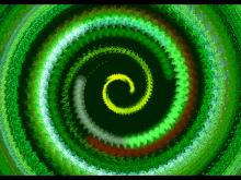
features one of the worst textures ever used for a tunnel. and it has innovative rgb lights in that fake-spheres scene.
I totally disagree with robotriot!!! It is not the worst texture ever used for a tunnel. The texture is a photo of a really cool bird with a purple head (atleast i think this is what it is)! But on the other hand the rgb lights in theat fake-sphere scene is not innovative, it's an old effect. On the top of my head this springs to mind. So the intro has received this sucky-sucky vote. (sorry feel free to suck my prods aswell)
Ugly and way too long. The texts would look nicer if the font color didn't vary all the time.
submit changes
if this prod is a fake, some info is false or the download link is broken,
do not post about it in the comments, it will get lost.
instead, click here !
