|
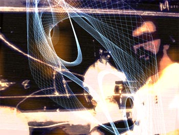
elektronimusiikkia by Matt Current [web]
[nfo]
|
||||||||||||||
|---|---|---|---|---|---|---|---|---|---|---|---|---|---|---|

|
|
|||||||||||||
|
popularity : 64% |
|||||||||||||
alltime top: #4469 |
|
|||||||||||||
|
||||||||||||||
| added on the 2004-08-08 12:32:21 by gloom |
||||||||||||||
popularity helper
comments
One of the best demos in the compo.
rulez added on the 2004-08-08 12:35:37 by hhhhhhh 
hardhitting but seems rushed.
AWESOME tune !!!!!!!!
yeap seems rushed but hey! its g0t style :D
yeap seems rushed but hey! its g0t style :D
still kicking tiny green bitches
rotating objects and "hardcore" music..
tucc. tucc.
activator.. learn before say shi.. is not rotating here :/
It's very... "demolike", in a good way, though there could be a bit more effect content. Still, definitely deserves a thumbs up.
haha what a shit, esc pressed
probably rushed.. a few objects rotating to the beat.. hohum :)
really good. the color sheme rocks!
Some good techno track and nice synchronization. The graphics don't work, though, at least not as much as in similar demos like 'a deepness in the sky' by mfx and 'medium'.
Doesn't work right on my computer but I love the music and what I remember from the compo was very nice.
The best Matt Current (PC) prod so far, should have ranked better. The music kicks ass, the effects are cool and the texts rock too.
I dont know.. looked like a ca 1998 demo to me. I did not like the music and it was so repetitive I had to press ESC..
this one rocked my boat. bigtime!
fucking excellent.
should've placed a lot higher. but as always, voters suck.
should've placed a lot higher. but as always, voters suck.
\:D/
This kicked some ASS at the compo, mostly thanks to the great soundtrack. The visuals are maybe a little too repetitive, but I like it.
at last demo with finnish lyrics which is not so corny. great job
naah..
I like the tune but I dont get the visuals. Too static for my taste and just boring. I experienced the synching as quite exact but a but unimaginative.
the lines were nice and some other things but it didnt convince me.
matt current can do alot better.
matt current can do alot better.
(ooh groupvoting) bigups to jean9! needed a rewatch to fully appreciate it from my side, but it seriously kicks!
Really rocks!
groovy
another mediocre Matt Current demo.
Crap music ?
one effect demo ?
i definitively don't like it
one effect demo ?
i definitively don't like it
Sorry but this is very simple, boring, and pointless... :( Looks like an old dos demo from the end of 90's... 'foobar' better was better and that don't shown. :(
boring shite..
Quite sexy. The music rawked.
music wa nice
uh.. i'm sure this was intented to be hot but it just isnt. muzik lacks dynamixx, visuals are plain ugly and demoflow is hecktic.
smoke more pot & try again!
excellent music.
kinda namupala
Kinda ugly, but nice music and lyrics =)
mouaich... :-/
fucking good musics and nice demo:DD
bang bang bang... nice opening for the democompo!
nice
Lyrics was a nice thing. Otherwise it was quite casual
not my piece of cake
yarrrh
one of the cooler demos in the compo at assembly04
music was great, visuals didn't match it for me. But it gets my vote for the "best disguised slow 3d engine ever" award ;D
crap
crap
one of the best demos of asm ?
I really don't know how this made it to the finals..
I really don't know how this made it to the finals..
not my style
I didn't mind some of the wireframe stuff, but even then it wasn't really well animated and didn't contain any nifty and/or unusual movement. The grainy backdrops and clean lines didn't really match-up well for me.
update:
the music FUKEEN RULEZ on 20000 W sound-system
the music FUKEEN RULEZ on 20000 W sound-system
I don't like it. It is out of my range.
intermediate
the effects with the lines where nice ;)
"Esc"-demo
The first seconds of this demo are not bad, thanks to the nice visuals (in particular the ones with lines). So it begins repeating the same material... one time... two time... the third time I found the "esc"-key particularly attractive but I resisted, throwing away some minutes of my life.
Simply boring and pointless.
Simply boring and pointless.
watch this one once, with the lights off and the volume up. You'll love it. then delete it and move on. impressive at first glance though
strong message, something to detest or identify with. the demo looks like a vj set, i would have liked to see some more demoish content.
Nice.
music? what music?
some parts are a bit overloaded visually, but all in all this is a great piece! especially the music.
the music is good. and the rest isn't, really. standard random design city. almost no code. i can't even compare it to shitfaced clowns on gba.
for my it's tha pig considering the nice track.
for my it's tha pig considering the nice track.
music was ok buts screens seemed to be a but to jumpy/allover the place for my likeing although there are a couple i liked.. thumb for music and colours.
Not my cup of tea..
I liked the wireframe angles.
The words are from Kurenniemi, right? AUTO-THUMBUP
music
kurenniemi
yep
se oli vain elektroni-elektroni-elektroni-elektroni-elektroni-elektronimusiikkia
TIL: It wasn't from Kurenniemi, it was from composer Bengt Johansson's short lecture from the 1958 radio program "Musiikin näköaloja. Keskustelu elektronimusiikista."
lists containing this prod
submit changes
if this prod is a fake, some info is false or the download link is broken,
do not post about it in the comments, it will get lost.
instead, click here !
