|
We have pasta by Collapse [web]
[nfo]
|
||||||||||||||
|---|---|---|---|---|---|---|---|---|---|---|---|---|---|---|

|
|
|||||||||||||
|
popularity : 60% |
|||||||||||||
alltime top: #49879 |
|
|||||||||||||
| added on the 2004-08-22 14:36:48 by Gargaj |
||||||||||||||
popularity helper
comments
nice. reminds me of Impulse from Nowhere... kinda too dark tho :S
rulez added on the 2004-08-22 14:37:15 by Gargaj 
no good for me
not too bad
another wannabe fr-08
reminds me of pre-'99 dos "3d-demos". the static stuff was horrible, but those two other parts (that was on the screen way too long i might add) were cool. :)
Some nice bits, some not so nice bits. Piggie.
Crashed my computer quite nicely.
Spiral staircase!
Oh hm, this was okayish but like gargaj said: too dark.
Oh hm, this was okayish but like gargaj said: too dark.
jop too dark. okay prod
This qualifies for a whole pigpen


Way too dark...
But the few things I could see on the bigscreen looked really cool, so thumbs up
But the few things I could see on the bigscreen looked really cool, so thumbs up
gargaj: hmm.. wouldnt say that this reminds me of impulse from nowhere.. it has better textures and lighting, but the modelling in ifn is way better.. enough about that.
a quite okayish intro.. liked the coded effects, the scenes where a bit boring.
as i said, the coder effects makes me thumb this one up ;)
a quite okayish intro.. liked the coded effects, the scenes where a bit boring.
as i said, the coder effects makes me thumb this one up ;)
party code?
80% horrible, ceils to a 100% sucks.
too incoherent...
could have been way better
dejavu static things, neat coded-morphing effects.
deja-vu static stuff, neat coded-morphing objects
oops :P
hmm a precalcbar would have really fit that remaining 4k ;)
oh and next time try not to show the bad mapping on the cylinders ;)
not bad tho, so no thumbdown
oh and next time try not to show the bad mapping on the cylinders ;)
not bad tho, so no thumbdown
something was ok on it
Nice black render :)
please, don't let coders do the gfx...
Nice for being party coding but the scenes were too dark for my taste.. and sorry but the stairs really suck :)
I didn't really get the point of alternating between those rooms and "nuskool" 3D objects. Most scenes were ugly, the music was quite bad and the looping of the camera movements was a bad idea.
Was good for the first 3 seconds, but then it got boring
One of the effects was good, but I didn't like the intro
nice morphing objects, boring static scenes (too much fr in them). this equals to a pigface. looking fwd.
That one have nice things but some scenes needs to have some background or more things in movement, actually collapse prods needs it usually, keep on it shash!
very inconsistent. ok.
so-so
fränt! :)
opening credits look like a thumb.. but sadly gets worse from there. not bad textures
We have drums!
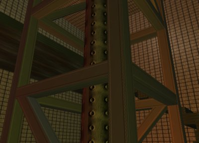
The staircase's camera looked a bit weird, and the opening room seemed to have "random abstract objects" :) But the screenshot scene is nice.
Oink!
The staircase's camera looked a bit weird, and the opening room seemed to have "random abstract objects" :) But the screenshot scene is nice.
Oink!
so so
submit changes
if this prod is a fake, some info is false or the download link is broken,
do not post about it in the comments, it will get lost.
instead, click here !
