|
my own monoscope by Marshals
[nfo]
|
||||||||||||||
|---|---|---|---|---|---|---|---|---|---|---|---|---|---|---|

|
|
|||||||||||||
|
popularity : 61% |
|||||||||||||
alltime top: #13963 |
|
|||||||||||||
| added on the 2004-04-19 02:09:07 by bomber |
||||||||||||||
popularity helper
comments
Overlays look nice, but overall too slow.
Pretty nice - nice graphics. But it seems it's OpenGL, but maybe you're using software postprocessing?
not for me, sorry (at least it ran, not like the other two marshals demos from marast)
nice looking, but so kucking slow ... and i don't see why !! Rendering the scene 3* for the overlays or what ???
Outstanding, boys, outstanding.... Perfect shape and well designed demo, a coocon poetry inside :), pefect "must hear" electrocore msx by Nula
very very interesting!
Sorry for flaming, but i were extremly nervous watching the results, i think that "Own Demoparty Flooding" sucks (et je ferai pas de thread Zone ;)
But it was a nice demo compared to the breakpoint demos.
But it was a nice demo compared to the breakpoint demos.
very nice demo
Nothing special here.
some good things, but the whole prod not rulez
Nice music and feeling.
Something missed in this prod. I think the music not fit perfectly and degrade the overall...
ok music, interesting filters, no coherency between the scenes
ok design, seems to finish when it reach the middle, ok prod for me
ok design, seems to finish when it reach the middle, ok prod for me
Wha hey! Rather nice. The 3D Scenes were a little bit boring (Except the Tunnel at the end, which looked rather nice).
But the design rocked quite much, imho.
But the design rocked quite much, imho.
nope... it's ugly (yuk for 3d scenes)... design sux too
w00t!
Love it!
Love it!
Started out promising, but then dropped off the demoscene cliff. The credits w/ photos was really uncecessary.
Every demo looks like this.
Nice design and music, 3D was also good.
lists containing this prod
submit changes
if this prod is a fake, some info is false or the download link is broken,
do not post about it in the comments, it will get lost.
instead, click here !

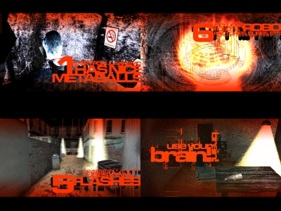
The top-right effect on the screenshot was nice, the other things was ugly. But, congratulations for making a demo with your feet, it should be difficult. Nevertheless the music makes this package more compact, so i think you should remove the nice effect to reach the bottom.