|
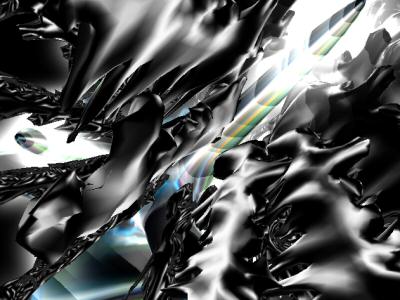
Alien's Sorrow by Critical Mass
[nfo]
|
||||||||||||||
|---|---|---|---|---|---|---|---|---|---|---|---|---|---|---|

|
|
|||||||||||||
|
popularity : 64% |
|||||||||||||
alltime top: #6473 |
|
|||||||||||||
| added on the 2004-03-06 23:26:17 by Phantom Lord |
||||||||||||||
popularity helper
comments
i liked it...good sync!
rulez added on the 2004-03-06 23:47:12 by blkpanther 
yuck. what horrible textures, and that bassdrum needs to come down a few hz as well as getting a faster envelope.. the code was decent i guess, but ruined by the bad music and the terrible textures.
nice work
Felt nice! As Gloom alreday said, the music could be better, atleast some of the instruments. A couple of nice models and an overall good intro!!
jmm.. i thought it was a 4k O:) ...
also.. i wish it was a 4k..
oldschool music but nice designs
The textures, or rather the colour scheme in general, was a big let down. However, I really liked the music and the scenes, and thought the whole intro was very good indeed.
the tunnel part with that strange-shaded object was really great. the rest... not so
Good work.
"1998 called", etc
and want their demo back! SMURF! now i
have one free hit anytime i want...
have one free hit anytime i want...
Well, well... obviously a lot of work in 3d modeling. And good sync. But, ouch, what surprising colors! And the trax: so sucky. I've seen much better from C.M.
Some scenes were ugly because of not-very-interesting textures. Im thinking of the concrete-textrures etc. But i found the abstract scenes really great, a brave color scheme, but its not ugly. Good modelling, music could have been better. Overal a good prod
Well, seems like there's an abuse of coder-colors :) But the rest was rather nice (the flow, the meshes, etc) so a weak thumb up for me, just because the colors hurted :P
like sagacity said
Nice. Not as great (abstract objects and effects seen before), sometimes boring, sync was good, deserves a little thumb though..
ouch.. these colours redefine nasty.. :) Maybe next time.
he not that bad .... i ve seen better from CM but this is more than fine for me
Wow! That great music and graphics and
all in only 50K. OK, my PentiumII 266Mhz
was not very fast with gfx... ;-)
all in only 50K. OK, my PentiumII 266Mhz
was not very fast with gfx... ;-)
the code seems okay-ish, but the rest kind of sucked. A piggie for the effort
yep, music is not good enough (compo, and drums sux)... horrible textures... but we can some work on the code...
I liked it. Music could be better.
Horrible music and ugly textures&objects. even tough atg sucks, one can do better textures with it than seen in this prod
no
down, you whiners!
Some disturbing colors but otherwise nice intro!
hmm, design was good.
however, I don't like the music.
ugly some 3Dobject and texture.
and too slow code.
sorry...
however, I don't like the music.
ugly some 3Dobject and texture.
and too slow code.
sorry...
neat 1
The colours were pretty awful and textures incredibly plain. Movement was pretty limited, both for objects and camera. Music didn't offer much either. Really weak viewing.
Yeah!
mediocre.
bleh!
some ok effects but not good enough to offset the weak models and textures
Really impressive, indeeeed. Couple of hi-poly models, decent quality track and cool glow(?). Some texture colors and camera movements annoyed me, but overall, imo, the intro's best Russian 64k of 04. Congrats to Phantom Lord.
Yeah, CMS is still with us! We need you, dude(z) ;).
Yeah, CMS is still with us! We need you, dude(z) ;).
nice for 49k, next time fill the 64k :)
Effects are worth a thumbs up, definitely. The rest.. could use some work.
piggylike
not special, but good enough to keep watching enjoyably until the end
same as above.
good
cool enuff
oink. thumb up for metapouet!
mehh
some scenes are good, some not. piggie.
submit changes
if this prod is a fake, some info is false or the download link is broken,
do not post about it in the comments, it will get lost.
instead, click here !
