|
DUBrovnik by Gammel Opland Af 1891 [web]
[nfo]
|
||||||||||||||
|---|---|---|---|---|---|---|---|---|---|---|---|---|---|---|

|
|
|||||||||||||
|
popularity : 67% |
|||||||||||||
alltime top: #1227 |
|
|||||||||||||
|
||||||||||||||
| added on the 2011-11-07 09:21:00 by datsua |
||||||||||||||
popularity helper
comments
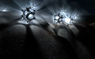
The screenshot scene is awesome :)
rulez added on the 2011-11-07 09:33:29 by leijaa 
The bouncing light-spike-balls ruled HARD.
The volumetric light-ball-things rolling down the hill was undoubtedly the best single scene of the compo for me :)
What the rest said, I also enjoyed the music. Great demo!
Interesting styles in this demo - lots of cubes too and the already mentioned light-spike-balls are cool to watch :)
Made a Youtube for it:
Youtube(HD)
Made a Youtube for it:
Youtube(HD)
This is just fantastic!
What a strange and disjointed demo. The screenshot thing is one of the most awesome things I've seen in any demo ever, and the beginning was lovely, but I would've liked a bit more consistent style. In any case, a well-deserved thumb up.
More "alt-ASD", but this time with fewer WTFs and more OMGs.
You guys keep amazing me. Yet another rock-solid prod on your part there! Amazing visuals!
Interesting. Like it more than the winning demo.
Should have won!
rules hard :)
Eier.
i give thumb!
Gorgeous.
wow
mixed bag imo. the only thing i really liked were those objects as seen in the screenshot, but they werent really used to their full potential either (their movement was very 'stiff' for one).
Exactly what Preacher said.
Surprisingly, the varied music fits very well the different styles in the demo. Pretty decent guitar work too (less pretentious than ASD, but much more effective, at least for me).
Loved it! Classy visuals and a great sound track.
i like spikeballs even more now!
Somehow neither the visuals nor the music appeals to me.
ok.
what maytz said
OMG! screenshot scene is EPIC :D
so me.
it looks really nice and the sound is quite okay but i miss that wow-feeling. well crafted demo without a doubt. but i only can give a piggie.
Thumb up for the rolling spikeballs.
Some nice tricks, but sir, I dont like it so much.. the music that is.
Getting better at and after the landscape scene imo.
Wow! Very cool demo!
Yep.
I enjoyed this different presentation all the way. The screenshot is from the best scene. But the soundtrack could have profited from non wobble bass.
My winner
Good effort, but what plek said.
Nice visuals, please make better music next time.
GREAT !
Should have won !!
Those lightballs. Those lightballs.
lightballs are the new spikeballs
.
Some interesting scenes but execution lacked too much.
cool demo, disliked the colours though.
oh, and finally a guitar in a demo soundtrack that don't feels out of place ;)
oh, and finally a guitar in a demo soundtrack that don't feels out of place ;)
Nice lighting!!!
Shit music and pretty bland in the beginning, no real design whatsoever for the most part. BUT, the latter half had some very nice effects and the overall visual quality is quite good. Very light and malnourished thumbs up, but thumbs up nontheless.
Wow my, such wonderful visuals and effects, effects, effects!!!
Demos cool, soundtrack is a pony.
Yummy lightballs :3
Improvement from their previous demo.
The music, the mood, the effects...the spikeylightballs..it all came together so well imo. Hope to see you kick ass at a foreign party some time.
The music, the mood, the effects...the spikeylightballs..it all came together so well imo. Hope to see you kick ass at a foreign party some time.
spikeballs rule hard!
The great démo (music, code, design) your win kingarden 2011 for me :) !!!
what BiTbUsTeR said.
Light balls domination :D From beginning to the end a great one, More please :)
Do it in a more consistent way and it will be awesome!
Nice demo, but the bad english almost ruined it for me.
Great final scenes with the landscape and hexagons. Earlier stuff was a bit incoherent.
didnt like the color scheme, but for the screenshot scene - up! :]
Some wonderful stuff in this demo! Great!
good
Nice one, keep up the good prods
love the volumelight spikeballs! not sure about those guitars in the electro though. you know me :)
O_o--b
What gloom, Zplex and Optimus said, and whatever KeyJ will say :3
Less brown next time please?
Less brown next time please?
What mog said ;)
No, seriously: this demo rocks. So many great scenes ... and I actually love brown :)
No, seriously: this demo rocks. So many great scenes ... and I actually love brown :)
I found it ugly and uninteresting until the terrain with spike balls scene. From there the level went way higher.
The balls effect potential could have been exploited much more though.
The balls effect potential could have been exploited much more though.
This is the KG winner for me, but the screenshot scene deserves to be in a more polished demo like Phon.
great stuff! The second half was even greater!
nice.
very good prod, a lot of great scenes especially scenes with lightballs
thumbs up for the spike-lightballs!
I like the balls with lights, but that's it. Oh and I barked during it loader screen. :D
Bark!
This demo is great!
There's a lot of cool concepts and plays on old ideas that I hadn't seen before!
The progression from calm to intense was nice, too.
All in all, super cool!
That said, the demo lacked coherence, IMO. There was a bunch of cool stuff happening, but none of it fit together.
Also, the scene poetry section kinda fell flat because the grammar was incorrect, the poem didn't rhyme, and the screen showed just a flyby with floating words.
Great work! I hope to see even more awesome stuff from you guys in the future. :)
lots of cool ideas, but the execution didn't reach me. also care for the music.
Nice :)
Very good effects, It gave me a weird but enjoyable feeling.
Has some nice visuals but lacks punch.
Fucking great! The music rocks!
vote
very nice prod. music rocks.
what leijaa said!
Music is annoying, effects at the beginning suck, especially the crummy looking wood etch thing at the very beginning. Instead of looking like the wood was being tunneled into, it just looked like an overlay moving around on top of the wood (maybe that's how it was supposed to look i dunno).
Interesting effects, but none were perfect. The beginning was lame...
Start kinda sucked, but then it got better. Music is 'k. Motivational thumb up.
I hate cube based demos in general but this one had really interesting effects. Personally really liked the spike ball coming out of the flat screen of cubes near the start.
beginning sucked but then it got better and better, especially the music and the lightballs were very good.
Weird demo. Really good tech, but it just feels kind of ...weird.
Some very nice parts, specially the one in the screenshots, fantastic ambiance with these god lights, music fits well!
Didn't like the music, the poetry was a bit empty. But the cube/hexagon stuff was awesome.
Brilliant stuff. Some of the visuals are not so appealing, but do a join venture with Excess, Gloom's music and their sense of style plus your new ideas could be kick ass!
Very nice!
I loved it live, and the group name alone deserves a thumbs up =)
Not a big fan of the music. As for visuals, the voxelization is neat and the lightballs work quite well.
However, the balls shouldn't have been dropped from still - that looked kind of off. That scene was also a bit glitchy, which didn't look done on purpose. Maybe my compy is to blame though.
So slightly piggy, but new ideas and motivational thumb (three prods first time? neat)
However, the balls shouldn't have been dropped from still - that looked kind of off. That scene was also a bit glitchy, which didn't look done on purpose. Maybe my compy is to blame though.
So slightly piggy, but new ideas and motivational thumb (three prods first time? neat)
I love Gammel Oppland.
Their demos ain't too bad either. A lot of cool stuff going on here, I love all the details I didn't see on the bigscreen.
Their demos ain't too bad either. A lot of cool stuff going on here, I love all the details I didn't see on the bigscreen.
this thing is massive!
forgot.
rather ugly demo and horrible music.
nice variety of cool effects!
Many good ideas. But the music sounded to disoriented for me...
Great soundtrack!
One of the more impressive demos I've seen in a while.
i have no idea!
Nice
nice
submit changes
if this prod is a fake, some info is false or the download link is broken,
do not post about it in the comments, it will get lost.
instead, click here !
