Paintovers
category: gfx [glöplog]
stylish thread. why you all don't make such cool and stylish demos :/
why don't you?
i'm not designer.
Nice stuff mog and gaspode! I wonder how it would look with a non-plain background.
What Preacher said. Still the best thread in ages :)
cherri kandler: if you're not a designer, a good way to make cool and stylish demos is to take some screenshots of your current work and get a designer to do a paint over. You'll get lots of cool design ideas this way.
If only there was a thread for that :)
If only there was a thread for that :)
i'm musician.
This is interesting, but I think maybe doing a paintover on Preacher's awesome line art doesn't tell the whole truth. ;) The paintovers look great, but my initial reaction was, you could give that black and white line picture to a toddler with crayons, and it would probably look reasonable.
My stuff is from the opposite end of the spectrum. I don't know where the fine line between joke vs. non-joke is, but here's a screenshot of one of my first raymarching experiments last year.
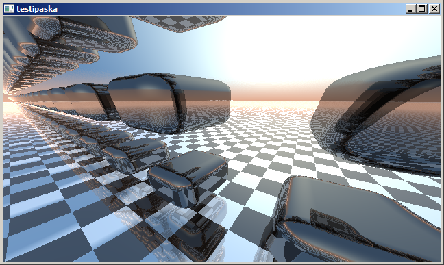
My stuff is from the opposite end of the spectrum. I don't know where the fine line between joke vs. non-joke is, but here's a screenshot of one of my first raymarching experiments last year.


please :)

Thanks!
@gaspode: That masked bar reminds me on melrose space, and I'd watch that demo :)
Not so fond about the lack of contrast, though depended on the music that could fit as well.
Not so fond about the lack of contrast, though depended on the music that could fit as well.
spike: I "Excessed" that for you. :)


@mog: Yeah, the missing contrast ist a bit extreme. Made it at night where the computer-display was glowing at me and the contrast seems much higher. But hey, perhaps I initiate with this a new era of low-contrast-demos. :)
gloom: thanks, that looks lovely! nice touch with the light/glow "splotches"/bokeh :)
@yzi: Had to cut a little bit on the left to get rid of the white area in the distance and draw more attention to the front-cube.
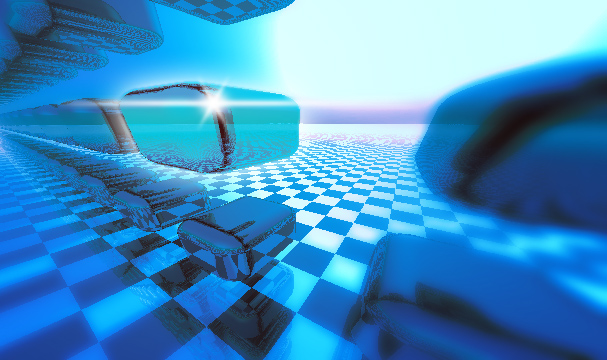

gaspode: wow, thanks! :D That would have looked good in the 4k intro, instead of that ugly piece of crap I eventually rushed out. ;/ (but then again it was my first modern effect coding in something like 10-15 years, so no harm done really)
But yeah, this is a very interesting and practical approach. I think I'll be bugging our graphic artists more in the future. ;)
But yeah, this is a very interesting and practical approach. I think I'll be bugging our graphic artists more in the future. ;)
this thread hit the bottom rather quickly.
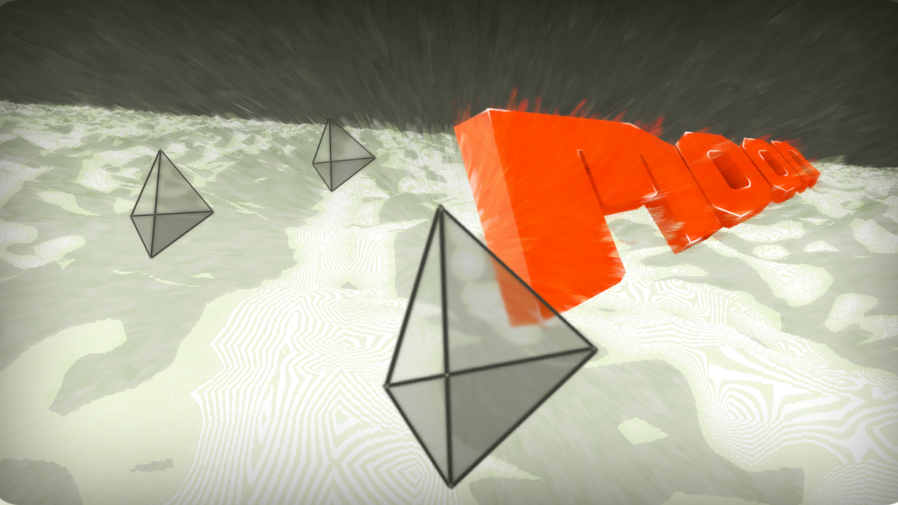
No idea why none of you tilts the cam to the side bit, as boring as flybys are - a slight angle adds a bit of dynamic :X
My black'n'white thing actually does that, it's just not visible in that particular screenshot :)
This is a great thread, it made me pick up photoshop for the first time in years and years. I already did some tries on screenshots posted here... if I come up with anything good, I'll post it here :)
This is a great thread, it made me pick up photoshop for the first time in years and years. I already did some tries on screenshots posted here... if I come up with anything good, I'll post it here :)
Okay, all minus you :)
Wow! I had a pretty tough weekend. But seeing all these designs here makes my day! Damn it... Now I have to do the next paintovers as promised. :-)
Spike: I tractionized your stuff :)


(Come dive with me,- a city lost kilometers under the ocean - "hey John! I found a hatch!" http://vimeo.com/6143315)
Preacher reminds more on your Attractor demos, just lacks the colour - moody <3
That really does have a cool underwater look mog :)
