Show what you do in Photoshop
category: gfx [glöplog]
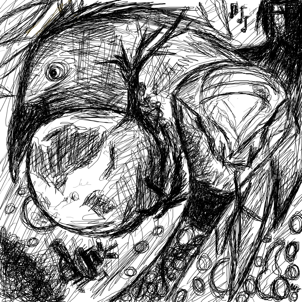
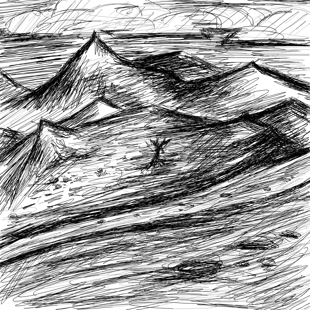
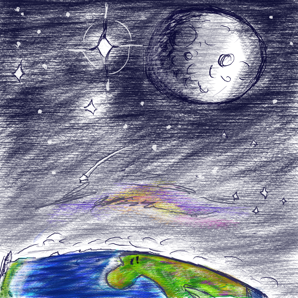
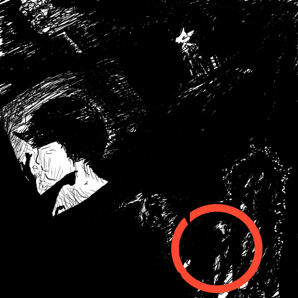
Sigflup, your style seems really interesting to me. I would really advice you to continue working on it as much as possible. Don't go for more realism, just continue developing it. It would be amazing in a real canvas, with real paint (oil better), and in a big size.
aww! thank you texel!! that means a lot. I've been experimenting with oil as of recent and I agree
yes i wish i could draw too
@Cros: You can. Once , every 4 years.
Self-portrait:


Not bad, but you need to put the eyes on the same level :)
that's not a small request if you're born that way.
Thank you!!! Also, one side of my face is smaller then the other. I usually always have a half-smile in that direction, toward the side that's smaller.
marsulpi: hahaha :D
marsulpi : looks like the leash holds itself, huh? :D
you always wear the same shirt? or you have hundrets like donald duck?
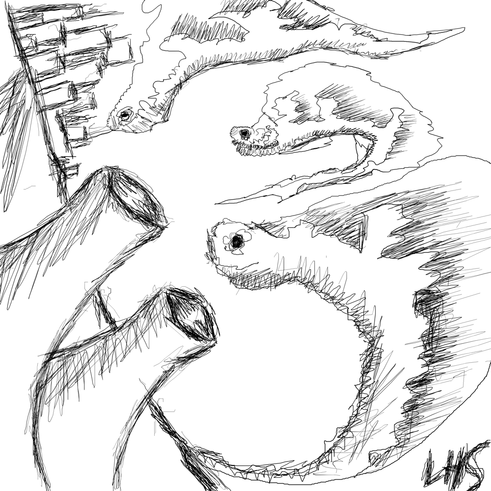
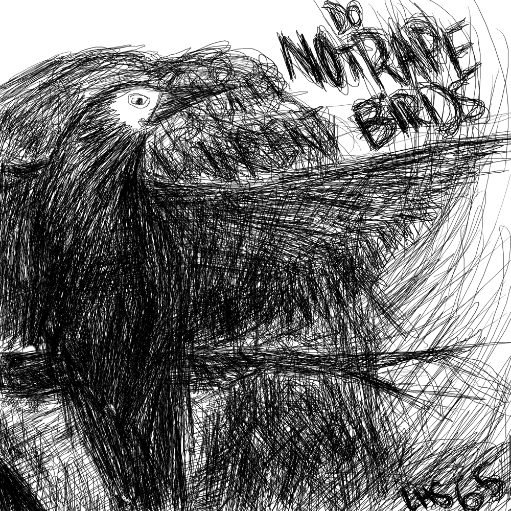
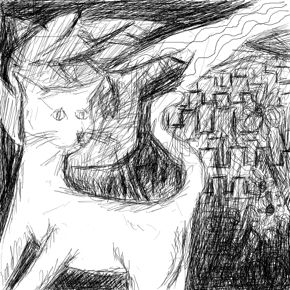
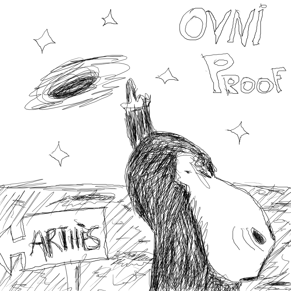
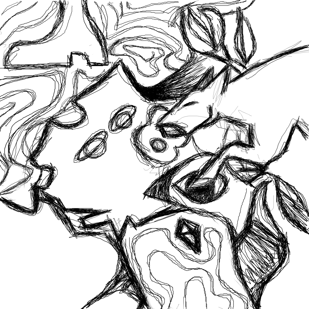
@sigflup: if you were to make a real proportions paint, kusma would be right, and not. Your eyes are perfectly aligned and your face is pretty much normal, with the asimetric differences all people have.
I believe this case is about self perception (you never look at any person in photos the same as if you look at yourself) and also a little problem with perspective in your paint. I think moving the eye betweeen 5 and 10 pixels to the bottom (the one at the left, your right eye) it would look far more natural.
And about self perception, it is usually because you are used to take a look of yourself in a mirror, and then, when you take a look of yourself in a photo, is it flipped horizontally to what you are used to see. So, you see small differences 2 times bigger. So, you will be looking at huge differences where for the most of the people are non appreciable...
I suppose this is sometimes difficult to believe, as the most of close people will tell you "no, you are not very asimetrical", while you continue seeing it in photos. There are two ways to see how far your brain is lying to you: first, try to flip horizontally your photos and you will see you are much more "natural", much more similar to what you expect of yourself. Also, go with a person you known from time ago to a mirror, and take a look of the reflection of that person.
thank you, texal!!


Superb colour and lighting in that bath pic Sigflup.
On one hand the loose style works well for a concept speedpainting, but on the other it has the potental to be so much more if you continue building on it.
On one hand the loose style works well for a concept speedpainting, but on the other it has the potental to be so much more if you continue building on it.
I nearly completely agree with wade there, except that he's probably thinking you need to develop the picture more and fill in the details, while i'm thinking the details distract and maybe you need less of them. The wall tiles are trying to steal attention from the face, which is the focus of the picture.
Your work is the most interesting on the thread recently for me, keep posting :)
Your work is the most interesting on the thread recently for me, keep posting :)
yeah indeed it would be cooler in this picture particullary if the background was more diffuse or something
I do think it needs more detail, but not necessarily down to each hair or freckle. Just enough to sharpen the stray edges and tidy up the sketchiness.
I think this loose style is great for concept art and thumbnails as it does what it needs to do - capture the mood, establish the colourscheme and gives an overview of the scene. But as with all concept art, it tends to be the first stage in a bigger process rather than a standalone piece.
Personally, I find this sort of thing really difficult to do, so props to you!
Quick shit, just for practice.


wow, that is fucking awesome
this one has been sitting around for a bit 

@frost, nice work there! I can see a strong style resonating from those brushes <3
<what sigflup said.>
Frost, thx for my brand new wallpaper! ^_^
Frost, thx for my brand new wallpaper! ^_^
