|
White noise can't jump by alien prophets [web]
[nfo]
|
||||||||||||||
|---|---|---|---|---|---|---|---|---|---|---|---|---|---|---|

|
|
|||||||||||||
|
popularity : 63% |
|||||||||||||
alltime top: #6368 |
|
|||||||||||||
|
||||||||||||||
| added on the 2000-11-10 12:52:48 by analogue |
||||||||||||||
popularity helper
comments
alien phrophets stand out from the crowd. they have their own style. this baby's their best piece so far imho.
added on the 2000-11-13 16:10:31 by _ 
dis socks!
Yes! Another great piece of art from AP. Nice soothing kind of music with fresh effects...watch it.
very well designed, beautiful i think, but the music sucks. see it
Well, there was a design, but I didn't like it.
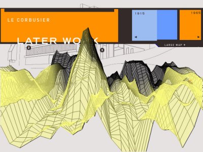
le corbusier is proud of you AP. 8)
Good design, nice music. Overall a very good demo.
(see previous post)
nice design, good music and fast code.:)
this one stands out. beautiful as fuck!
I like it! Not long enough, but still good.
this is my definition of danish numediaartdesign, and i like it.
if i recall correctly the soundtrack is even .xm.
two thumbs up for encouraging trackers that there is still a shed of light left for those without a copy of soundforge :P
if i recall correctly the soundtrack is even .xm.
two thumbs up for encouraging trackers that there is still a shed of light left for those without a copy of soundforge :P
hop. too fastly hacked and it shows but has very nice soundtrack and some cool ideas
good shit. unpolished at parts, but makes up for it in innovation.
ewwww.... well a mixed prod. I kinda like the visuals (especially the design shown on screenshot) but on the other hand it's a lil bit boring... so only a OK from me.
rulez but short
One or two additional effects would have been great.
Dunno why, but i don't like it much...
Oh, Le Corbusier... (was a scener)!
Short but characteristic prod, funny music and jaggy sprites!
Short but characteristic prod, funny music and jaggy sprites!
Alien Prophets have such a unique flair in their demos that "White noise can't jump" is enjoyable purely on that account.
This has no effects to speak of and a very abrupt ending that cuts short maybe the best effect they have in store here. Was it not for their style, I would be pointing my thumb downwards.
This has no effects to speak of and a very abrupt ending that cuts short maybe the best effect they have in store here. Was it not for their style, I would be pointing my thumb downwards.
cool
Hmm.. nice style.
Wasn't bad, but had no synching. music was ok.
This one resembles bad flash "design" websites too much
i like it and i'm all for good demos! so it must be good.
typical nu-school demo from around the millenium.
i like.
i like.
As a fan of 1998-2001 era design demos I have to say that this is random and mostly ugly.
short, but nice
what raer says, - more impressed that this demo just runs fine 14 years later - nuts!
so so
Nice little danish IDM demo
submit changes
if this prod is a fake, some info is false or the download link is broken,
do not post about it in the comments, it will get lost.
instead, click here !
