|
The Box by Mainloop [web]
[nfo]
|
||||||||||||||
|---|---|---|---|---|---|---|---|---|---|---|---|---|---|---|

|
|
|||||||||||||
|
popularity : 61% |
|||||||||||||
alltime top: #7546 |
|
|||||||||||||
| added on the 2002-07-21 13:27:20 by FreeAll |
||||||||||||||
popularity helper
comments
rulez
rulez added on the 2002-07-21 13:59:08 by ileaardbei 
too few effects
Absolutely rulez! I love the stlye!
perhaps a bit boring, still well designed and decent effects.
Really Nice. The colors on the big screen did it more justice though, artifacts are not that pretty.
(plek) very nice design.. colors could use some saturation and perhaps some different fx.. but very, very ok (/plek)
unfortunatly there's no texture on GeForce4
u2: the compomachine had a gf4 and it looked okay there.. check your driver? anyways; great intro, albeit a little repetitive in the end.
love the texts
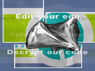
optimize your ego
decrypt your soul
edit our code
feel your brain
flip your normals
browse our files
decrypt your soul
edit our code
feel your brain
flip your normals
browse our files
The code seems kinda slow, but the design is sweet :)
its been a while since i've seen such an nice designed intro! this is one of my top favorite intro this year for sure. music is also very cool. good work mainloop!
crap
It does not work with my combination of windows xp, directx 8.1a debug runtimes, detonator 29.xx and gf2mx. (Gives pink/green stroboscope) Switching back to retail runtimes fixes the problem.
The intro is ok but the music sounds a bit off somewere in the middle.
The intro is ok but the music sounds a bit off somewere in the middle.
uninteresting seen-a-million-times-before visuals and a nice tune.
Looks not bad, but in general not very interesting. The Bypass intro was imo way better
crest, i guess i wont even try this one then.. ;-)
nice, but no real relevation
cute
Same as Tomaes, with an additional "boring".
i thought that object and the way it rotated between each scene was quite nice, but otherwise only ugly silvergrey textured objects. music was ok.
the "we love norwegian tp-winning demos" version of "the box" is now in stock at www.mainloop.dk
Tracker Mainloop out.
Tracker Mainloop out.
Doesn't look so "complex" and "technical" that it shouldn't run smooth on 900MHz duron and gf2mx with 320x240. And it's boring as hell too.
the flat background object is sweet, but that gooey crap totally ruined it.. too few ideas. music is nice if a bit repetitive.
a pleasant experience :)
a little slow and repetitive but nice style and cool music.
Doesn't run in direct3d debug mode indeed, when switching to retail mode it works but it's quite shocky on my P4 1,7 Ghz with GeForce 3 :\
Woah! - seems like we have some trouble with our direct3d - our coder is working hard to finish a much faster and less bugged version - we'll keep you posted!
The design is great, but the effects are all so mediocre and don't have any variation in movement.
ok i tried it, it was superior to the bypass intro for sure...
MY NEIGHBOURS HATES THIS BASS
MY NEIGHBOURS HATES THIS BASS
forgot to comment this, it rules!
ok music
awful colors, ugly design
good transitions, good code and liquid mercure effects
too boring because the design is not efficient
awful colors, ugly design
good transitions, good code and liquid mercure effects
too boring because the design is not efficient
started off really nice and then quickly got boring. too few fx and they are on the screen way too long.. thumbup for the style and good muzik tho'..!
ah, well, nice intro. superb music.
bah
Design, colors, music.
ok intro, although quite boring sometimes.
the lowpixel walkman guy rulez :)
the lowpixel walkman guy rulez :)
Could've been much better if it was just 2-3 minutes shorter. They at least gave the design a try, but it just doesn't really work out.
It starts out showing all effects and adds nothing, so there's no climax... And the music can't carry it for that long.
It starts out showing all effects and adds nothing, so there's no climax... And the music can't carry it for that long.
Very nice intro, but yes, it is partly boring. Showing the same effects again and again for minutes(?) isn't that good. The screenshot itself fits half of the intro. Anyway, you don't get your thumbup down there but here: 

Okay.
Nice oldschool production.
nice design.
submit changes
if this prod is a fake, some info is false or the download link is broken,
do not post about it in the comments, it will get lost.
instead, click here !
