|
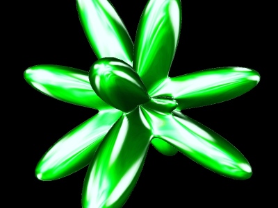
Tryggvification III
[nfo]
|
||||||||||||||
|---|---|---|---|---|---|---|---|---|---|---|---|---|---|---|

|
|
|||||||||||||
|
popularity : 46% |
|||||||||||||
alltime top: #81755 |
|
|||||||||||||
| added on the 2006-04-17 21:34:33 by anesthetic |
||||||||||||||
popularity helper
comments
nice to see some new people trying to make a demo, but in unfortunately this was not very interesting in any aspect. A tip to all you newbies: keep it short, unless you have many interesting things to show off, don't use black backgrounds, try to make new effects instead of just recycling open source ones, don't keep the camera looking at a fixed point (like the center of the object), don't use GREEEN.
sucks added on the 2006-04-17 21:45:23 by Duckers 
Duckers: I fear your demo making for dummies have spawned a bunch of entries in the compo. There was quite a few sin-balls, distorted spikeballs and cheap bloom.
I still think a first prod should never be thumbed down. This wasn't the worst of them.. but yes, it is rather GREEN.
well there's apparently there's two others..
+music
-evrything else
sorry.. spend more then a few hours on it next time! :)
+music
-evrything else
sorry.. spend more then a few hours on it next time! :)
just for the screenshot, the demo is bad...
all is ugly (even for a first prod)
submit changes
if this prod is a fake, some info is false or the download link is broken,
do not post about it in the comments, it will get lost.
instead, click here !
