|
kubik by Marshals
[nfo]
|
||||||||||||||
|---|---|---|---|---|---|---|---|---|---|---|---|---|---|---|

|
|
|||||||||||||
|
popularity : 61% |
|||||||||||||
alltime top: #8859 |
|
|||||||||||||
| added on the 2001-05-07 23:50:07 by bomber |
||||||||||||||
popularity helper
comments
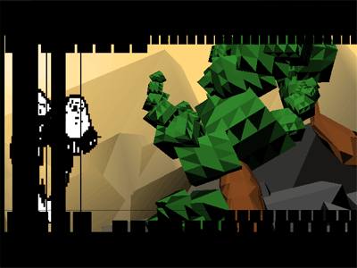
the music's cool but why do the graphics appear so weird? are they bugged or is it just my machine?
added on the 2001-05-08 11:34:56 by liz 
This is stylish and innovative art experiment! Gr8work MRS!
i like it when ppl do something interesting with flat shading for a change.
this demo is great.
this demo is great.
yep, nice flat ! but it miss some shading I think
Great style ! I really love the part through the clouds ;) Keep up the good work guyz.
yeah, the clouds scene is cute, but too many changes in music kinda distract me.. nice experiment though.
a demo with a deep thought by my opinion. the stress is in the idea, not in the implementatation, so it's just a bit useless to analyze each scene. a downright step forward for the Marshals, keep on trying and experimenting!
very good prod, stylish
music and sound ambience are excellent!
design and concept rulez a lot! flying in a dream in fact
a very good demopaja based prod !
music and sound ambience are excellent!
design and concept rulez a lot! flying in a dream in fact
a very good demopaja based prod !
This starts of by using flat-shaded blocky objects to create 'natural' scenes. Very interesting. Then goes to a flat-shaded city, finally the 'disturbing truth' at the very end. Artistic and well thought out. I'm just found it a tad on the ugly side. But this sort of exploration of ideas is great.
Allright:
This is a demo that basically just shows a few flatshaded scenes. But this is done in a astounding way showing the scenes as episodes of something that could also be called a "story".
Very stylish and with music that fits PERFECTLY. Very thumbs up.
This is a demo that basically just shows a few flatshaded scenes. But this is done in a astounding way showing the scenes as episodes of something that could also be called a "story".
Very stylish and with music that fits PERFECTLY. Very thumbs up.
A regular solid having six congruent square faces.
I liked it, although there was a lack of coherency what comes to the design of the given prod.
I liked it, although there was a lack of coherency what comes to the design of the given prod.
Despite the fact that I could really live without the 'urban part', it's a well done demo with some original elements. Soundtrack is ok, but could have been better though.
Very nice demo, refreshing different!
Very wild idea, how didn't I knew these demos before? However I prefer Real Geometry more, because these ideas want to be smooth, fast with nice chip music. That one is the most enjoyfull of all..
Nula´s music ownz !!!
can anyone fix that link please?
Wow! what a demo...
Could the screenshot be any smaller? =)
Pretty good overall, with a nice feeling, although some parts seem to static.
Pretty good overall, with a nice feeling, although some parts seem to static.
kinda stylish, but boring and ugly
Very Stylish Very Refreshing Code
Yes CanonBall
Nula's Musik ROX !!
Yes CanonBall
Nula's Musik ROX !!
The nature part (ocean, earth, air) is almost pleasant to watch. Some cute ideas here and there. Overall those heavily flat-shaded scenes of nature look funky. The city part fail to convince since it is much less unexpected, but features (poor) animation. The last, dark part produces a good atmosphere. A summary might be that it is disjointed, and worth at least a watch.
oh, last time i forgot to give a thumb up so here it is. now i'm gonna download and play it for my pleasure (i'm not affraid that this kind of "thinker" demo should get any old)
Nice design!
pity
When I read comments here, the idea is not mostly understood. KUBIK = CUBE demo. The story, scenes, design, music and all that atmosphere deserves more then my thumb.
ugly
lists containing this prod
submit changes
if this prod is a fake, some info is false or the download link is broken,
do not post about it in the comments, it will get lost.
instead, click here !
