| the return of darkness by Smash Designs [web] | ||||||||||||||
|---|---|---|---|---|---|---|---|---|---|---|---|---|---|---|

|
|
|||||||||||||
|
popularity : 60% |
|||||||||||||
alltime top: #58509 |
||||||||||||||
|
||||||||||||||
| added on the 2004-04-18 01:28:39 by dipswitch |
||||||||||||||
popularity helper
comments
Boring. Gave up watching it even in warp mode.
what cruzer said. yawn...
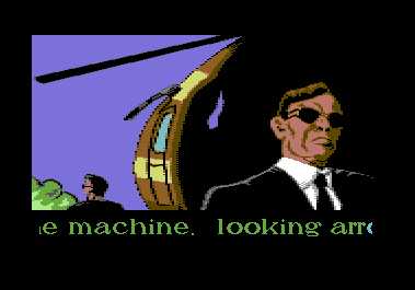
The sheer amount of 'Ghost in the shell' and 'Matrix' references in the gfx of this game intro is laughable (the screenshot is a good example). Secondly, this does not work as a demo, it's amazingly boring to watch it all the way through. Still, I hope that the game will rock.
Same here..
Don't find this one that boring. But it didn't deserve that rank in the compo.
And they gathered around the computer, loaded up the new Smash Designs demo with great expectations and... started watching. And they watched. At some point, somebody said: "maybe we should do something else". And they all agreed.
Not thumbs-down, as there's nothing wrong with it, I just wish my demos to be demos.
Not thumbs-down, as there's nothing wrong with it, I just wish my demos to be demos.
nice slideshow. but why did it need to be sooo long? the effect would be a lot better with way shorter dialogs... and maybe a few surprises like an animation here and there.
REALLY looking forward to the game anyway.
REALLY looking forward to the game anyway.
Seriously.. If you can't write an exciting story/dialogue, don't. I literally fell asleep during this one. Looking forward to seeing the game though!
The story is stupid and I've seen much better graphics by AEG before.
Just thumbing up the fact he's also working on the actual game... (turrican III)
Ugly graphics, stupid and boring storyline, painfully slow and horribly static...black suits and ties in the 31st century? ...bleeccch. Awful.
Dunno how it made 2nd place... kinda boring... I've seen the game preview though and the game *will* rock. :)
This is the most boring thing I've seen in my whole fucking life!!!
laser cutting animation and group logotype
scroll and text font
music
scroll and text font
music
Holy crap, this is even boring in warp mode, congrats!
boring
submit changes
if this prod is a fake, some info is false or the download link is broken,
do not post about it in the comments, it will get lost.
instead, click here !

actually i heard that smash designs was originally founded as game developement team, and only lateron started to produce demos. well, now it's back to the roots! =)