|
47K GREETRO by Hardread [web]
[nfo]
|
||||||||||||||
|---|---|---|---|---|---|---|---|---|---|---|---|---|---|---|

|
|
|||||||||||||
|
popularity : 60% |
|||||||||||||
alltime top: #13926 |
|
|||||||||||||
|
||||||||||||||
| added on the 2002-08-26 07:41:34 by pohar |
||||||||||||||
popularity helper
comments
Nice ideas, and good design to be a "first attempt".
Sorry, but the music is not that good, and the colors are coder colors.
But still, it have something.
Keep on working!
Sorry, but the music is not that good, and the colors are coder colors.
But still, it have something.
Keep on working!
A good prod with interesting effects...
Whoah ... Pohar will surely do great things as soon as he'll get a gfx-designer to work with him... I find this intro really nice for a first one, respect ;-)
Why is this a greetro? It like has only 3 greets :)
this doesn't look amateur at all for a 1st attempt! congratulations hardread
Really nice intro, everything fits! Deserved a better place
great effects!
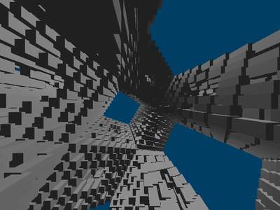
Actually thats a really good 1st try :) ..i always loved cubes, and this....OMG!!! they are everywhere o_O
Some pretty effects in there. An excellent first. Keep up the good work.
effects were quite solid, but the font, music and colours need to be improved!
A very good first try. I liked how the cube segments remained facing the screen while the entire object rotated.
Besides the facts that the music wasn't good and I hate cubes, it was quite okay.
classic hardread
submit changes
if this prod is a fake, some info is false or the download link is broken,
do not post about it in the comments, it will get lost.
instead, click here !
