|
Splash by Unknown Artists [web]
[nfo]
|
||||||||||||||
|---|---|---|---|---|---|---|---|---|---|---|---|---|---|---|

|
|
|||||||||||||
|
popularity : 61% |
|||||||||||||
alltime top: #5362 |
|
|||||||||||||
|
||||||||||||||
| added on the 2014-08-03 23:25:49 by anni |
||||||||||||||
popularity helper
comments
Solid prod. Nothing really special, but nice looking. I doubt that I will remember this thing in a year.
added on the 2014-08-03 23:51:26 by Bobic 
wow...
Awesome fast-made intro.
And even won the compo!
And even won the compo!
I think this is maybe trying a bit too hard—it ends up being very textbook, overreliant on shiny and a bit uninspired. But it generally executes the textbook well, so it's a borderline thumb.
well. ok.
Quote:
Agreed.by Sesse:
I think this is maybe trying a bit too hard—it ends up being very textbook, overreliant on shiny and a bit uninspired. But it generally executes the textbook well, so it's a borderline thumb.
:)
nice deservered the win
Might be textbook, but in all honesty, the 4k this year was filled with intros heavier on experimental elements (ours included). This was a classic 'turbo' 4k the compo just needed as a finisher. It deserved to win.
Nothing special indeed, but pleasant visuals and colors, and the music wasn't bad either. If this really was a fast prod, kudos for that.
I found this quite ok...
I never thought I'd see negative fades in 2014 :D
What Sesse said, without the thumb for now.
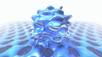
the screenshot scene makes me think of cold partynights on an airbed...
cool effect
what saga said
OK
I like the distorted parts.
hmmm
Solid, but also a bit boring and nothing new. Tune is nice, but lead synth doesn't sound very good.
This looked really cool while watching this at boozembly over the asmtv, but when seen at a better definition, it's yet another raymarcher with same old typical tinny 4k pseudochip.
generic visuals, ugly colours, awful synth.
I liked half of this, the crazy splash. I did not like the spiky ball on the air mattress
weak thumb
The distorted parts look awesome.
Too bad they are ruined by the generic "checkerboard" parts in between u___u
Wish the intro was built around the distorted parts, and they looked more "heavy"
Too bad they are ruined by the generic "checkerboard" parts in between u___u
Wish the intro was built around the distorted parts, and they looked more "heavy"
what break said :)
Not first in my book, still rocks though =)
This looked and sounded good. Ok, typical raymarching stuff, but yeah, there was nothing better at 4k.
superpolished but not mine.
nice 4k
Niiice! Great 4k!
Weak thumb from me. Would have looked better without the clickdrum timing.
proper
Nice
yes
submit changes
if this prod is a fake, some info is false or the download link is broken,
do not post about it in the comments, it will get lost.
instead, click here !
