|
Funkytown by Ananasmurska [web]
[nfo]
|
||||||||||||||
|---|---|---|---|---|---|---|---|---|---|---|---|---|---|---|

|
|
|||||||||||||
|
popularity : 58% |
|||||||||||||
alltime top: #16096 |
|
|||||||||||||
| added on the 2003-11-09 12:53:47 by daddyvx |
||||||||||||||
popularity helper
comments
minimalistic but ok and well, not that minimalistic anyway
rulez added on the 2003-11-09 13:01:02 by elkmoose 
poor code and gfx
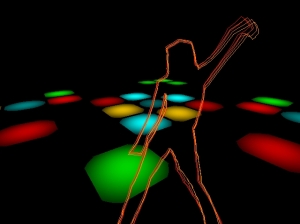
Especially the part from where the screenshot comes was pretty nice.
This kinda stuff was done better years ago in State of the Art, 9 Fingers, and Symbolia. Even still, this is only 64K and was okay to watch. A bit slow moving, though...
nice idea, but too slow.
Heh :)
i liked it
Enjoyable. Nice minimalistic disco action... And is that david hasselhoff in the screenshot?=)
Quite ok, but there are better "disco demos". The dropshadow on the font looks ugly, even if it helps to keep the letters visible (IMO outline would have been better). The dancer is nice, even though it naturally reminds of 9 fingers. Btw uncle-x, they said it was Britney Spears, not David Hasselhoff. ;-P
horrible music, off-colors everywhere and the cool dancing-outlines effect completely put to waste.
DiamonDie: where i was sitting the general consensus among the audience was that it has to be david hasselhoff...
it`s let down badly by the colour choice and the state of the art looking scene goes on far too long. music is quite chirpy.
If i take each first word of your comments I get : minimalistic poor especially this nice heh I enjoyable quite horrible DiamonDie (sorry:) I it.
Where is the truth?
Where is the truth?
DiamonDie is the dancer
kinda nice, but the colors are way too ugly.
I like the music and the effects follow the design. Short but good.
i like disco demos, and i think this prod could have excited me. but something's severely wrong with it. the groove's just not there at all. it's like james brown on valium. and a lot of the effects just looks amateurish - aliased lines, ugly fonts, poor transitions. at least the dancing lady is pretty cool (athough she seems to have enjoyed a drop of valium too).
Boring and ugly, sorry.
nothing more here, sorry
It's refreshing. A nice implementation of the old dancer idea. Slight inconsistency in the design. But what is that horrible black creature that flies from the "tunnel to the stars" ?!
too slow but ok enough
hm. no.
groovy! cool dance moves!
submit changes
if this prod is a fake, some info is false or the download link is broken,
do not post about it in the comments, it will get lost.
instead, click here !
